Reaching For Yield And Clubbing Baby Seals
With Greece “solved” and economic data topping expectations, we are back in full risk on mode. Once again the quest for yield is on every fixed income investor’s mind. “Reaching for yield” is a term used when investors make an investment based on wanting more current income. It may be a subtle difference, but the mentality of someone who winds up investing in an asset because it meets their current income hurdle, is different from someone who found an asset where they believe the risk/reward is priced extremely attractively. There are only 3 ways to increase yield:
- Extending maturity / moving out the curve / getting paid more to take longer dated risk
- Moving down the credit curve / investing in weaker credits
- Investing in more structured products — the more complex a security, the more it has to pay investors to take that risk
So in any period of “reaching for yield” the market sees a gradual shift as investors move out the curve, purchase weaker credits, or dabble in structured products. These are not in their usual “comfort zone” of investing. Someone used to investing in 3-year risk, is not accustomed to the volatility of investing in 10-year bonds. The investment grade investor may not fully understand the convexity of callable high yield bonds, nor the impact of secured loans above you in the capital structure. Worst of all, the straight bond investor who takes a punt on some structured assets may not fully understand the asset and is likely to overestimate its liquidity in bad times by orders of magnitude.
These shifts are generally very gradual. It takes investors awhile to get comfortable with the increased risk. As the asset class performs well, the investors become more confident in their decision making, and likely have even more need to reach for yield, so they continue adding more money to areas outside of their core competency. Then, one day, almost out of nowhere, something sparks off a sell-off. It is almost as though one day the asset class is great and the investor is smart, and the next day, the market is selling off and the investor has no idea why. If it were an area of their expertise, they might assess the market carefully and decide to retain their position, or even add. But in a market that they do not have much experience, the declining prices create fear, and ultimately, it is impossible for the investor who reached for a few extra bps to bury the sensation that they could lose far more money than they hoped to make. Those few extra bps, which the investor viewed as so important just a short while ago, were only available because this investment was MORE risky. That risk now becomes too much and the investor joins the selling parade, further feeding a sharp sell-off.
Credit markets consistently show long, gradual, upward trends, marked by short, fast, and relatively large downward moves. The reach for yield plays a large part in it, so it might be worth looking at some recent examples of how bad it was when the reach for yield investors got clubbed like a baby seal.
The reason that the drops are so sharp is that the opposite of the “reach for yield” is “flight to safety”. If it was “flight to relative safety” you would see a contained pullback. Investors would move to slightly shorter maturities, or slightly higher up the credit spectrum, or into assets slightly less complex. But that is not how it works. When the “flight to safety” occurs, all the weeks, months, or potentially years of incremental risk just want out. They want the 2-year treasury. The process is gradual and incremental while investors reach for yield, followed by a gut check and risk-off mentality, resulting usually in a dramatic sell-off.
It is worth noting that the examples I have chosen do not all overlap. Some were relatively isolated, and some came at times where other credit markets (and stocks) were experiencing sell-offs. High Yield bonds seem to have the most trouble avoiding being dragged into credit problems in other markets. That is likely because high yield is the ultimate reach for yield. It is not quite equity, but is risky, and when liquidity evaporates in other high beta credit products, people sell high yield as a way to reduce credit exposure, and so they can shift assets into the newly higher yielding alternative bond market. High Yield is a proxy market, almost a last stop hotel for most people. It does best when the “reach for yield” is at its peak mania. Unfortunately, this means it has the maximum number of inexperienced investors at the worst possible times, where the upside vs downside risk is most skewed against the investors.
Greece 2007-2010
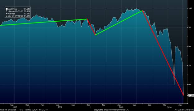
Look at the Greek 10-year bond that was issued in 2006. While the PIIGS trade was already in fashion in the beginnings of the financial crisis, what I find most interesting is how little it sold off on the back of the Lehman bankruptcy. It did sell off sharply, undoing a year of price appreciation, but nothing like other credit assets that had big moves down. Then it steadily increased in price until Dec. 2009. Then, almost out of nowhere, the bottom fell out of the market. Investors were piling into Greece because it offered a pick up to German or French debt. Investors wanted that incremental yield. These bonds hit a multi-year high right before they were decimated.
GGB 3.6% 2016 from July 2007 to July 2010
Municipal Bonds 2010
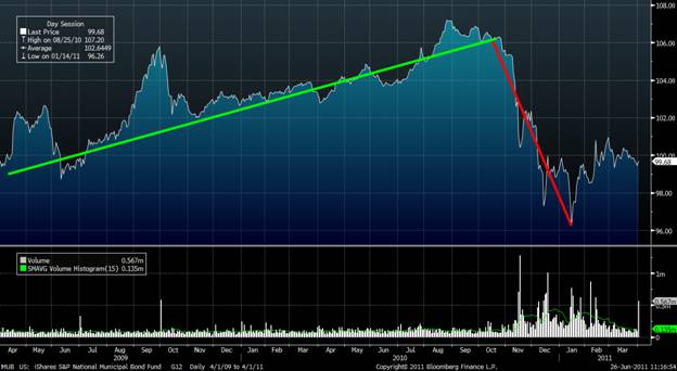
Using the MUB ETF as a decent proxy of the muni market, it is another interesting example of what happened. From early 2009 until September 2010, these bonds continued their gradual recovery from their post-Lehman lows. The gradual trend higher did have a couple sharp rises but these were followed by equally sharp declines so I have focused on the long-term trend line. What caused this sharp sell-off? A sell-off that was completely isolated from other credit markets which were enjoying the QE2 inspired risk-on trade? Meredith Whitney came out and clubbed this market into submission. This market move is particularly interesting as she did not have any prior experience in the municipal bond market. A lot of experts had strong negative views on the market, but she threw out numbers that caught the media attention, and managed to almost single-handedly crush this market. Clearly there were conditions in the market that let this happen (there always are) but anyone who doubts that credit markets become illiquid far faster than they could imagine should stare at this chart for a while before allocating too much money to riskier credit markets in their search for yield.
MUB April 2009-April 2011
ABX (Mortgage Market) 2008
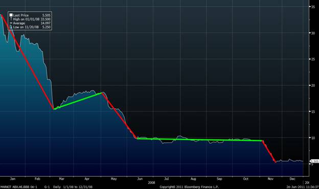
First, I have to admit that I could not find historical data for 2006 and 2007. ABX “BBB” had traded close to par until various shocks took them down to a price of 35 by the start of 2008. When I could only find data back to 2008, I figured I had lost the opportunity to point out the “reaching for yield” for ABX. But even looking at the price action in 2008 of a dying or dead asset class is worthwhile. The year starts with a sharp decline, followed by a small, slow rebound, followed by another drop. Then just slow and steady until another sharp drop with Lehman. People buying something at 35 at the start of the year were doing more than just “reaching for yield”, but I suspect a lot were people not were not experts with ABX but who felt it the move down had been so precipitous that it simply could not go much lower. Of course, in hindsight it did, and the pattern of periods of stable performance followed by sharp drops, is clearly visible.
ABX BBB S6-1 Jan 2008 – Jan 2009
CDX IG Index
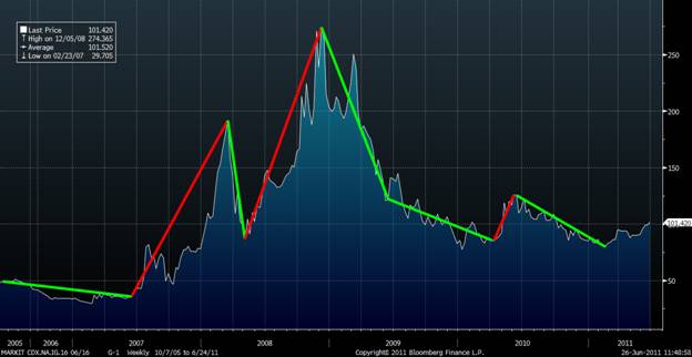
This next chart is the performance the CDX IG indices. It attempts to adjust for the index rolls so that it can be looked at as a continuous series. Since this chart shows spread (as opposed to price), moves up are the times of credit weakness. The same pattern of extended periods of gradual spread tightening followed by steep gaps wider is clearly visible here as well. The initial spike wider are the beginnings of problems in subprime starting in 2007 and culminating in the Bear Stearns bailout. It was followed by another spike wider (this spike actually pre-dated Lehman, and even FNMA). It is only fair to point out also that there were 2 periods where the indices had sharp moves tighter, in contrast to the other credit markets. Since these indices are “hedging” products and “fast money” products, they faced a much great squeeze pressure than “real money” or “retail investor” products at the time when government intervention and news flow were immense.
CDX IG Generic Chart 2005-2011 Weekly
Emerging Markets
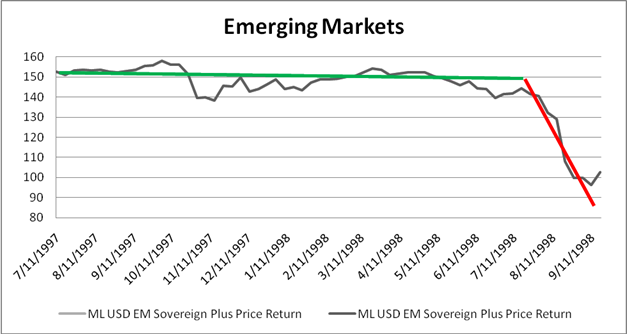
Here is just a quick look at one of the old Merrill Lynch Emerging Market bond indices. The chart is the price return of that index since inception. Once again we have the classic pattern of a long period of relative stability followed by a short sharp price drop. This drop was triggered by the Russia crisis and LTCM collapse.
Investment Grade Bonds
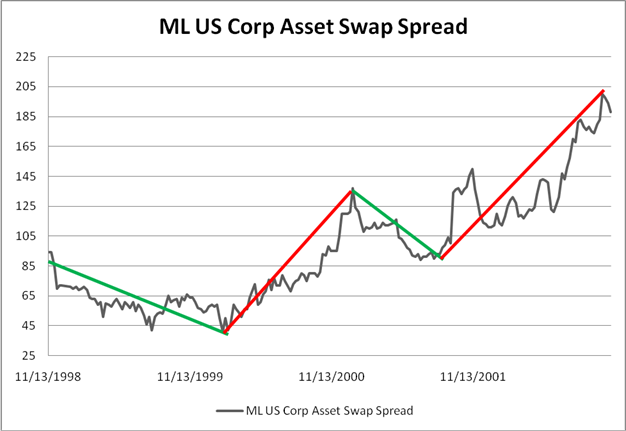
We looked at investment grade spreads using the CDX indices earlier. Here is the performance of a corporate bond index on a spread basis. One of the problems with any historical analysis of credit is data quality. Even as recently as the 1990’s you had to take the data with a grain of salt. A lot of the bonds were matrix priced – a fancy way of saying someone took a quick guess at the end of the day based on a couple of inputs. One effect is that corporate bonds seem less volatile than emerging market bonds over the same timeframe. There is an element of truth to that observation. On the otherhand, EM actually traded, so the prices were real, while the corporate market didn’t trade as much and many of the prices were “sticky”. In any case, even this data captures the broad trend moves over this time period. Here the spread widening periods were only slightly steeper than the tightening periods, but moved for longer time frames. The first widening was Enron and September 11th. The second followed WorldCom and widespread fears on names like Devon and Nortel. The “reaching for yield” story is not as compelling on these charts, but again part of that is data quality. Although it may not seem that a move from 45 bps to 125 bps is much, but in practice if and investor who owned a 5-year bond (bought at 45bps which widened to 125bps) would have a mark-to-market loss of about 3 pts which is a bigger loss that all the spread the investor expected to make over the entire life of that bond.
High Yield Bonds Over the Long Term
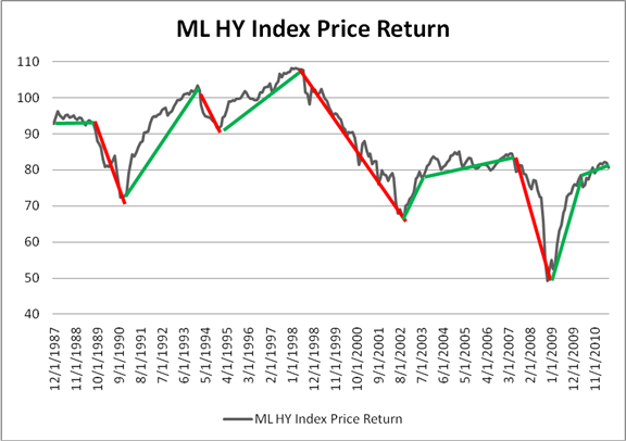
In High Yield, looking closely, there is a shorter-term pattern of sharp drops after relatively long quiet periods. This pattern does not show up well on the monthly graph below spanning almost 25 years. But over the longer term, there is a similar pattern. High Yield does have the advantage of also having had a few sharp rallies, much more so than most of the other credit products. The explanation, I think, is that the drops are higher than IG and, unlike ABX, the default rate even at the worst times was bearable. We might be in store for a much longer continued period of stability, but history shows, that when people want out, they get out fast, and there is almost no one to replace them. That is a problem with being a proxy for equities and the last hope of the yield chasers. Once people don’t want equity and desire safety over yield, there is a big shortage of replacement buyers.

